 |

| |
|
|  |
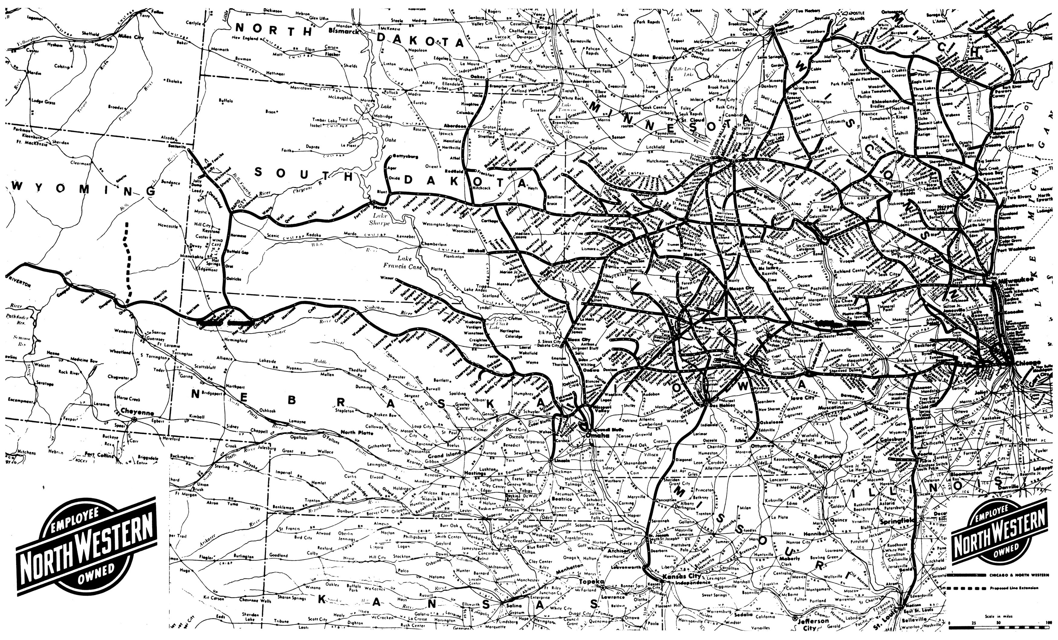
Chicago and Northwestern Railroad, 1977.
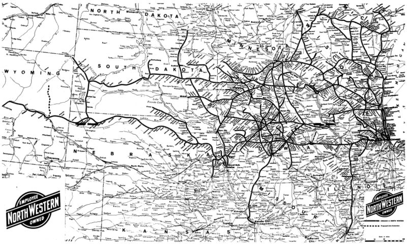 Map of the towns serviced and tracks used by the Chicago and Northwestern Railroad, effective as of 1 August 1977. Scanned from a small centerfold in the railroad's timetable booklet. Labels: 1970s, 1977, maps, railroad
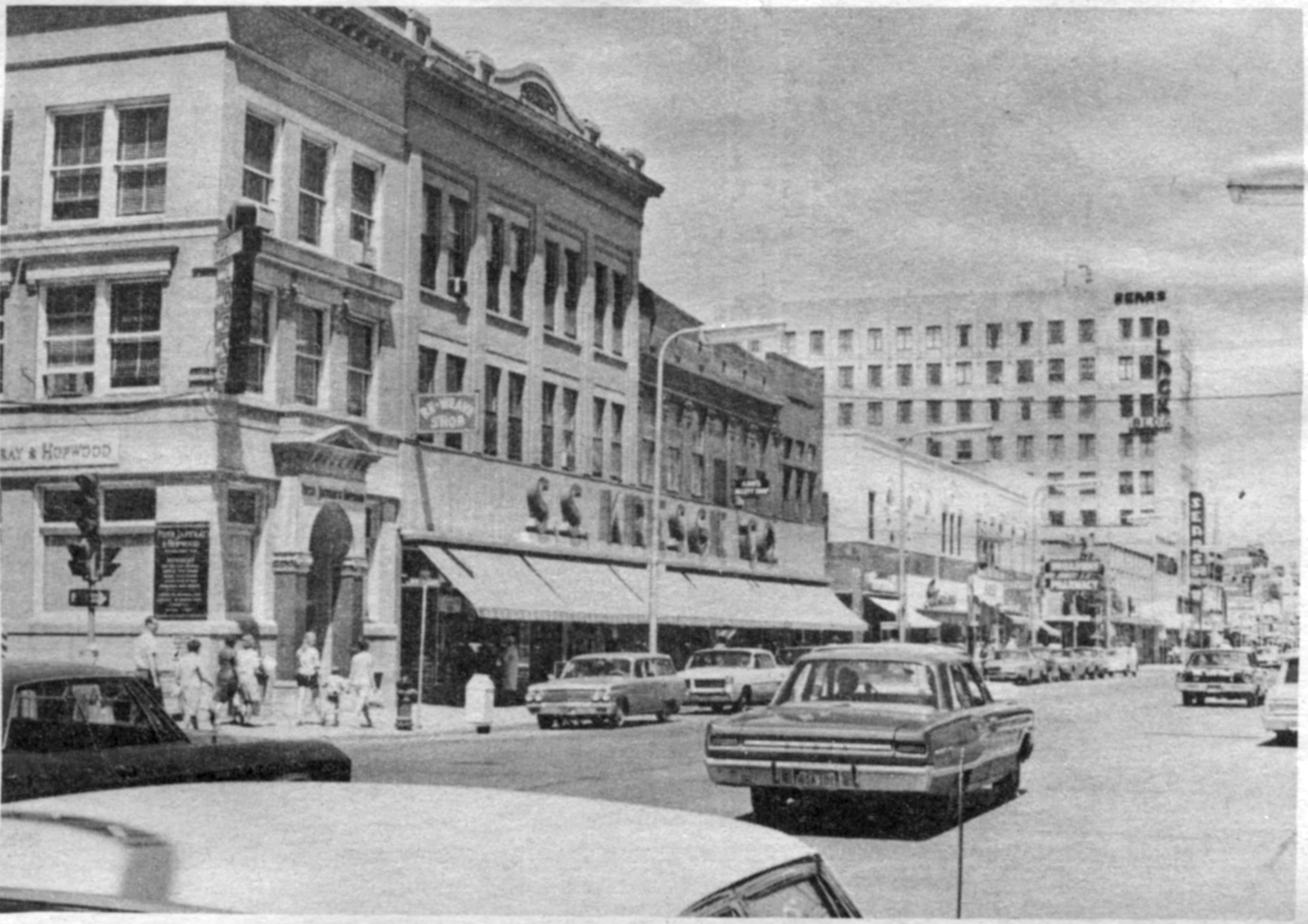
Cinerama-70 in Fargo
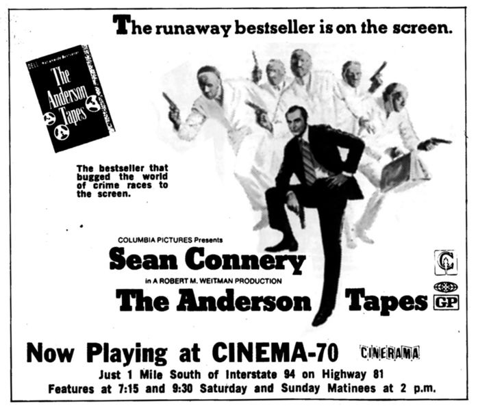 I don't remember the Cinema-70, but by the time I was old enough to become a moviegoer it had changed to a 3-screen, 35mm multiplex like all the rest in town, where I had to sit on my mom's lap for Return of the Jedi because it was so full. The theatre closed shortly after, and sat vacant for a decade, until it was torn down and turned into a parking lot for the gym next door. In 1971, however, it was a single-screen "Cinerama 70" theatre. In the 1960s, whoever built the theatre banked on the belief that Cinerama, the wide-aspect-ratio film style popularized in the late 50s and early 60s, would be there to stay. By the 1970s Cinerama was rarely used, few studios even had equipment to film in it, and it had been bastardized from the original 3-camera setup to an anamorphic widescreen format. The Anderson Tapes was filmed on standard 35mm film with a normal aspect ratio, which left over half of a Cinerama screen unused. It's no wonder the theatre broke up their one-room schoolhouse into a three-screen theatre. On the right-hand side of the ad, it looks like a typo, but not really: 1971 was in some of the early years of the MPAA's voluntary film rating system. "GP" was the replacement for the "M" rating, when people found the "M" and "R" ratings too hard to tell apart. "GP" meant, essentially, what "PG" means today, but too many people thought it meant "general public", thus confusing it with the "G" rating. There was just a narrow 2-year window when "GP" was used. Labels: 1970s, 1971, cinerama, fargophilia, movie theatre
Fauna of the USSR
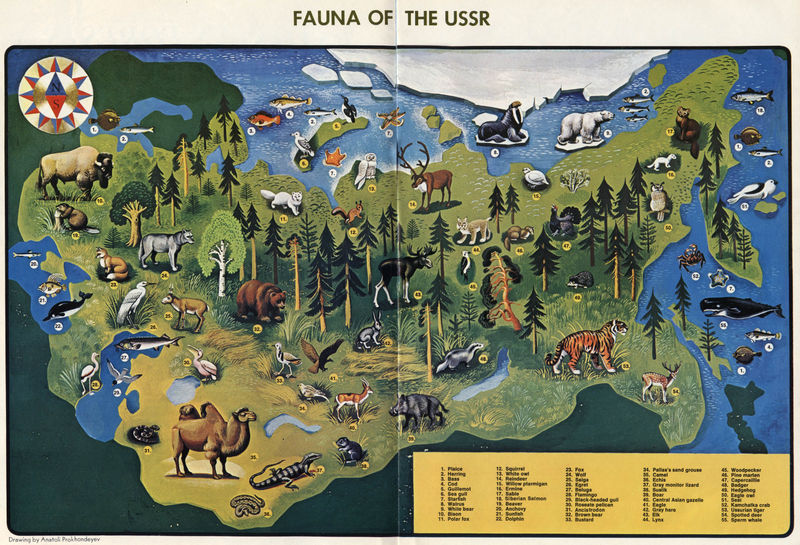 To avoid appearing American-centric, here's a map of the USSR's wildlife from 1972. A decade or two after the USA wildlife map I posted a couple weeks ago, this USSR map comes from the pages of Soviet Life Magazine ( see also) . It shouldn't be surprising, but the similarity to our American wildlife is readily visible. Both countries cover similar climates, span comparably mountainous, arid, wet, warm, and cold areas, and were (geologically speaking) connected not too long ago. It shouldn't be a shock to find deer, moose, bears, badgers, and so forth. There's a few asia-centric critters here, such as monitor lizards, camels, and tigers, but compared to our mountain lions, alligators, and turkeys we locals tend to forget that rather exotic creatures live in our backyards. The USSR map seems to have far fewer critters than the US, but that accounts for American excessiveness: the US map has a lot of repetition; look around the edge of the map for a more accurate count, and we'd be about the same if it weren't for all the different bird variants on the US map. Labels: 1970s, 1972, maps, ussr, wildlife
The Racecar of Typewriters
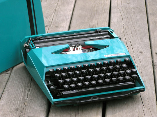 In 1970, two prominent companies within their respective industries came together to produce the item on the right. Smith Corona had been producing typewriters and other office equipment since the 19th century. Ghia Design was changing the European automobile design world by creating speedy shapes for manufacturers, most notably the Karmann Ghia. The "Super-G" wasn't revolutionary in its interior; the mechanics were standard portable-typewriter parts seen in numerous other SCM models. The most notable design features are on the closed-case cover: striking, vibrant colors (turquoise or orange), a racing stripe, and the Ghia logo. I initially thought that Smith-Corona may have simply licensed the Ghia name, but the bold "DESIGN BY" in the logo seems to verify that some designer in need of a pet project was taken away from cars and handed a typewriter design handbook. There is a bit of a disconnect between the interior and the exterior of the typewriter. The cover has straight, speedy lines with softly rounded corners, much as you'd find on a car. The interior, however, exhibits the sharp modernism that was approaching through the 1970s and 80s. One might equate it with the Ghia concept cars that followed shortly thereafter. In the coming years, Ghia was bought by Ford, and Smith Corona found that mechanical office equipment was ending up in the landfills. Ghia still makes cars, but rebranded Ford models; Smith Corona still puts text to paper, but in a more computerized way. For a short time, however, the unlikely pair managed to make the nearing-obsolete typewriter technology look like it could hold it's own in the Grand Prix. Labels: 1970, 1970s, ghia design, smith corona, typewriter
Bud's Chicken Take-Out
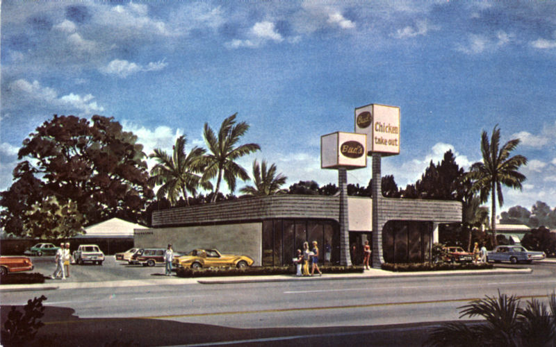 Bud's, according to their website, has been in the takeout business since 1957, slingin' food from one location until 1976. This postcard, I believe, is that second location -- it's not a photo, but an artist's rendering: those people look a bit too mannequinny for to be real, copied right out of Entourage. The design is very seventies, composed of futuristic curves, floor-to-ceiling windows, and smooth lines, combined with the ecologically-friendly wood shingles and lots of plants in the decor. The signs mimic the palm trees in the background, rooted trunks sprouting from the ground and narrowing towards the top, but terminating in huge, mostly-empty cubes proclaiming the product available. According to the back, this location sprouted up at the corner of Worthmore and North Dixie Highway, catering to the "tremendous population growth" in South Florida. Bud's has grown to seven locations, but they're not at 2200 N Dixie anymore...that location has become a Dunkin' Donuts. Labels: 1970s, Bud's Chicken Take-Out, Florida history, restaurant
The Byelorussian Soviet Republic: 1971
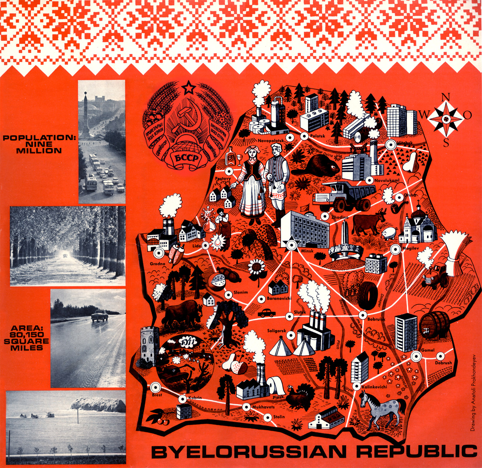 This map appeared in the front cover of the December 1971 issue of Soviet Life magazine. Soviet Life, as you might have guessed, has grown along with its namesake, becoming Russian Life today. Back in the 1970s, the magazine presented the Soviet Union in a less-than-propagandic way, avoiding too much political content and focusing on common life in the USSR. It made it into the hands of Americans, under the agreement that the Soviet regime would distribute the magazine America to citizens of Russia. In this issue, we learn of Belorussia's contributions to the world, its participation in WWII and the United Nations, and its advances in arts and sciences. Most all of the article content can be found condensed into this illustrated map, showing off everything from classic styles of dress to cheese to construction equipment. The big logo in the middle is the Soviet-era symbol of Belarus, slightly different from an earlier style (which in turn was based on a general Soviet symbol): today's symbol is strikingly similar, but exchanging the hammer and sickle for their own nation's outline. While retaining some Soviet symbolism, the country changed its name from the Soviet-sounding "Belorussia" to "Belarus" with their independence. Labels: 1970s, 1971, belarus, maps, soviet, ussr
Ethiopian Air's Aviaticus Solaris Empyrus
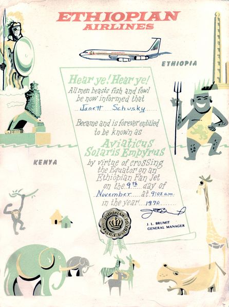 On November 9th, 1970, Janett Schusky was flying on an Ethiopian Airlines 'fanjet' plane (Probably a Boeing 720) when it collided with a natural feature: the Equator. Impacting this line, 90° off the rotational axis of the planet Earth, caused damage to neither passengers nor craft, but Schusky's survival entitled her to the title " Aviaticus Solaris Empyrus", seemingly a jumble of important-sounding Latin words that may translate to something along the lines of " Flyer to the Heaven of the Sun." Ethiopia's famine and troubles during the 80s and 90s may make it seem backward and aboriginal, but they've been operating an airline as long as many European countries. Unlike last week's TWA certificate, which promotes air travel as a worldly benefit, Air Ethiopia's certificate here seems to promote Ethiopia's connection to the rest of the world, despite having to cross the Equator to get there. Labels: 1970, 1970s, certificate, ethiopian airlines
When Flair Was King
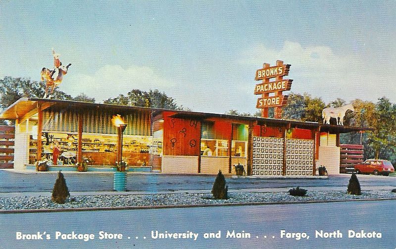 About a month ago, I drove past that ugly modern office building on the corner of Main and University, and struggled to remember what was there before. Then, I found this postcard, and memories rushed back in. No, I don't think I was ever in Bronk's (we were a Polar Package Place family; it was closer to our home), but its central location in Fargo and garish exterior would make it hard to forget. I'm going to look through my archives and see if I can dig up any more on Bronk's, but I don't remember seeing anything about it recently. Today, garish exteriors are reserved for children's restaurants and theme buffets -- the interior of a liquor store isn't inherently anything, let alone to be 'themed' to attract customers. Modern stores aim for neutral efficiency, and 'vice' stores want to project professionalism lest they be called uncouth...but back in the day, when someone said to stop at the liquor store with the cowboy on top, you darn well knew where to go. Bronk's disappeared in the late 80s by my recollection, and was replaced by a law office building. No cowboys on the top of the law offices, sadly. Labels: 1970s, bronk's, fargo, fargophilia, liquor store
| |
|
|


